
Quick start
From an empty report to a working chart. Roughly ten minutes if you use the sample data.
On this page
1. Install the visual
- In Power BI Desktop, open the Visualizations pane.
- Choose … → Import a visual from a file.
- Select the
.pbivizfile. The chart icon appears at the bottom of the pane. - Drop it onto the report canvas and size it generously — org charts need room, and the side panels want space of their own.
2. Load the sample data
The project ships a sample dataset that exercises every feature, including a NAVSEA command-leadership chart with civilian billets and a dual-hatted flag officer.
- Use Get data → Text/CSV and pick
orgchart-model.csv. - Load it as a single table. Do not split it — the visual expects one flat table.
- Check that the numeric columns loaded as numbers and the date columns as dates.
Column names are numbered on purpose. They read
01_dataType, 02_id, 03_title and so on, so the Fields
list sorts into the same order as the visual's field wells. Work straight down the list
instead of hunting.
3. Bind the fields
The starter model is setup so the user can just click the checkboxes from top to bottom to have the fields mapped easily.
Note: The 20_details columns must be dragged over individually if multiple are used. The
29_lastVerified and 31_chartUpdated fields must also be dragged over directly as they are date fields.
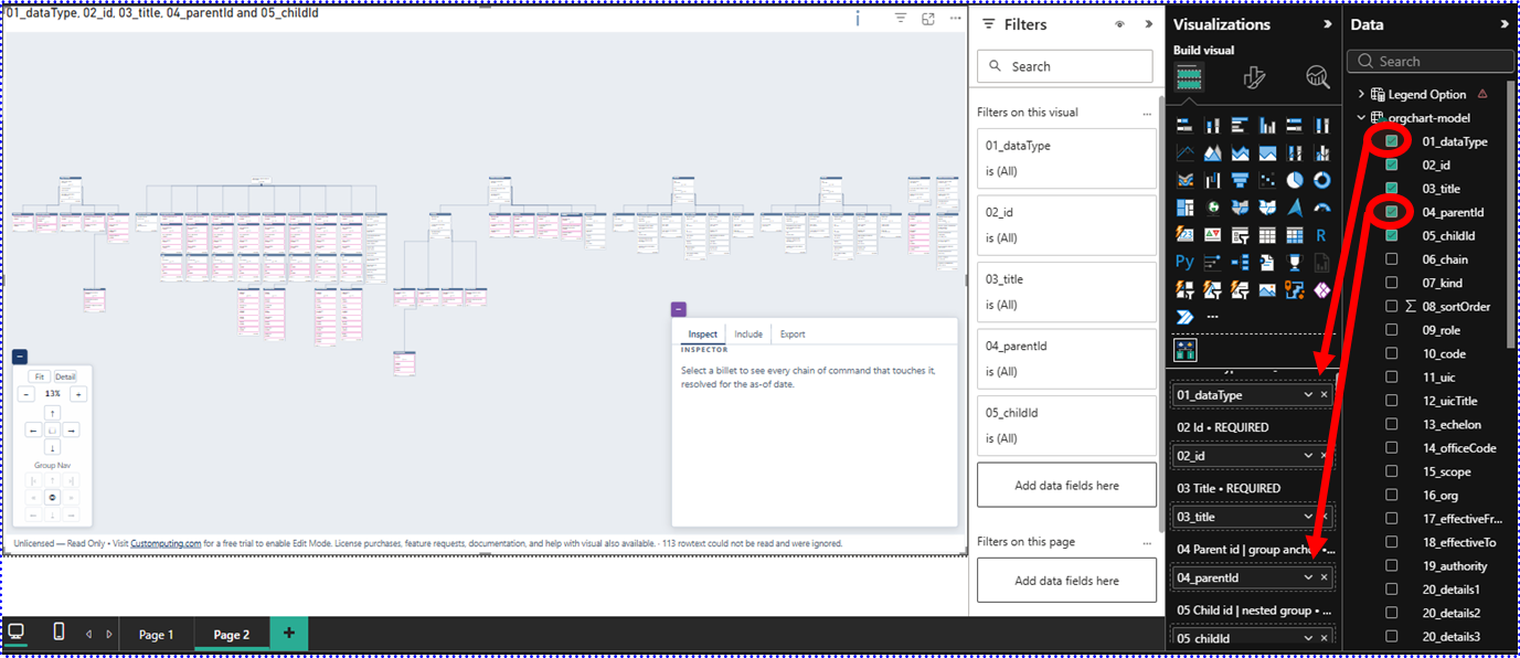
Eight fields are required. Everything else is optional and can be added later.
| Field well | Column | What it does |
|---|---|---|
| 01 Data type | 01_dataType | Which kind of thing each row describes |
| 02 Id | 02_id | Primary key of that thing |
| 03 Title | 03_title | Display name |
| 04 Parent id | 04_parentId | Reporting parent, or a group's anchor |
| 05 Child id | 05_childId | Reporting child, or a group's parent group |
| 06 Chain | 06_chain | Which chain of command an edge belongs to |
| 07 Kind | 07_kind | Billet vs org, group type, assignment type |
| 08 Sort order | 08_sortOrder | Ordering within a parent or group |
Bind raw columns, never measures. Drag columns in as-is. If Power BI shows a field as Sum of…, click the arrow beside it and choose Don't summarize. This visual reads one row per record and does its own aggregation; letting Power BI aggregate collapses the table and the chart will show a single node with no roster.
4. Configure the essentials
Open the Format visual pane. Three settings matter on day one:
- Chart → Chart id — which chart to draw when the data holds several. Leave blank to use the first.
- Chains → Spine chain — which chain determines layout. Almost always
ADMIN. - Cards → Card width — widen if your billet titles wrap awkwardly.
Everything else has a working default. Come back to the format pane once you can see a chart.
5. Where to go next
Field reference
All 41 fields, what each does, and which columns do double duty.
Data model
How to build the flat table from your own source.
User guide
Reading and navigating the chart once it renders.